SpRING Term week 8
Date: 12th & 13th March 2024
Tutor: Siân and Rob
Tutor Led
What to Bring
Bring extra unstretched paper this week. It needs to be the type of paper that you would be using to paint a picture, which is usulalyBockingford in our classes. You will need a few pieces which enough space on each to work on, so the larger the better up to a half sheet, though quarter sheets will be fine.
You will also need your paints and brushes.
We will be bringing photographs to work from this week. You can also find them HERE


TIPS
1 Look at the coloured image.
Break down the image into areas of light, mid and dark colours. Where are the lightest colours? Where are the darkest colours? Where are the colours in between?
2 NOW look at the B & W versions ( Scroll through the gallery using the arrows at the side of the picture)
Break down the image into areas of light, mid and dark tones. Where are the lightest lights? Where are the darkest darks? Where are the mid-tones?
3 Now ask yourself these questions:
Where are the darkest dark tones? Are they in the same place as the darkest colours?
Where are the lightest light tones? Are the highlights in the same place as the lightest colours?
Where are the mid-tones? Does their placement in the picture match where you bought the mid-colours were?
When you first look at the picture, are you aware of whether your eye is drawn first to the lights, the darks or somewhere in between?
Did you eye follow the same path across the image in the three different versions?
Were there areas where what you perceived to be two distinct colours merged into one patch where viewed in B & W?
Were hard edges in colour that became soft edges when looked tonally?
TOPIC of the Week: INTRODUCTION to the theme for the term
This term we will be looking again at tone. We will be looking (hard!) at how drawing can increase our awareness of tone. We will be also be considering tonal values across an image within a composition, and ways of increasing our understanding of the relationship between tone and colour.
Gallery of the week
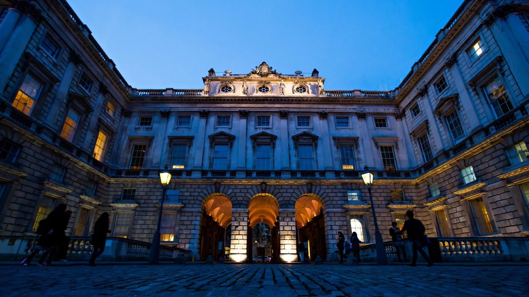
The Courtauld gallery, Somerset House, Strand, London, WC2R 0RN
The Courtauld
The Courtauld is an internationally renowned centre for the teaching and research of art history and a major public gallery. It is particularly known for its Impressionist and Post-Impressionist paintings and exciting programme of temporary exhibitions.’ This gallery is well worth a visit !
‘The Courtauld Gallery’s collection, which comprises over 33,000 objects ranging from the Middle Ages to the 21st century and includes paintings, drawings, ceramics and sculptures, among others, is available to explore in its entirety online for free for the first time thanks to a new digital platform.’
Do take a look at the The Courtauld Collection Online.
The Courtauld Institute of Art is also known for its world class art courses in art history, curating and conservation. The range of courses is extensive, from degree and postgraduate courses to short courses and ‘Study Tours’ abroad. While the London based course are probably inaccessible for most of us, they run a surprising number of online courses of varying lengths that look very interesting,
Last updated: 11.12.23